


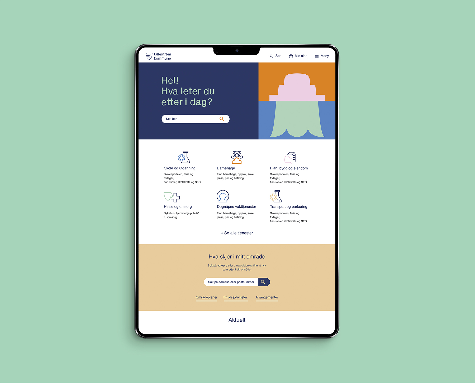
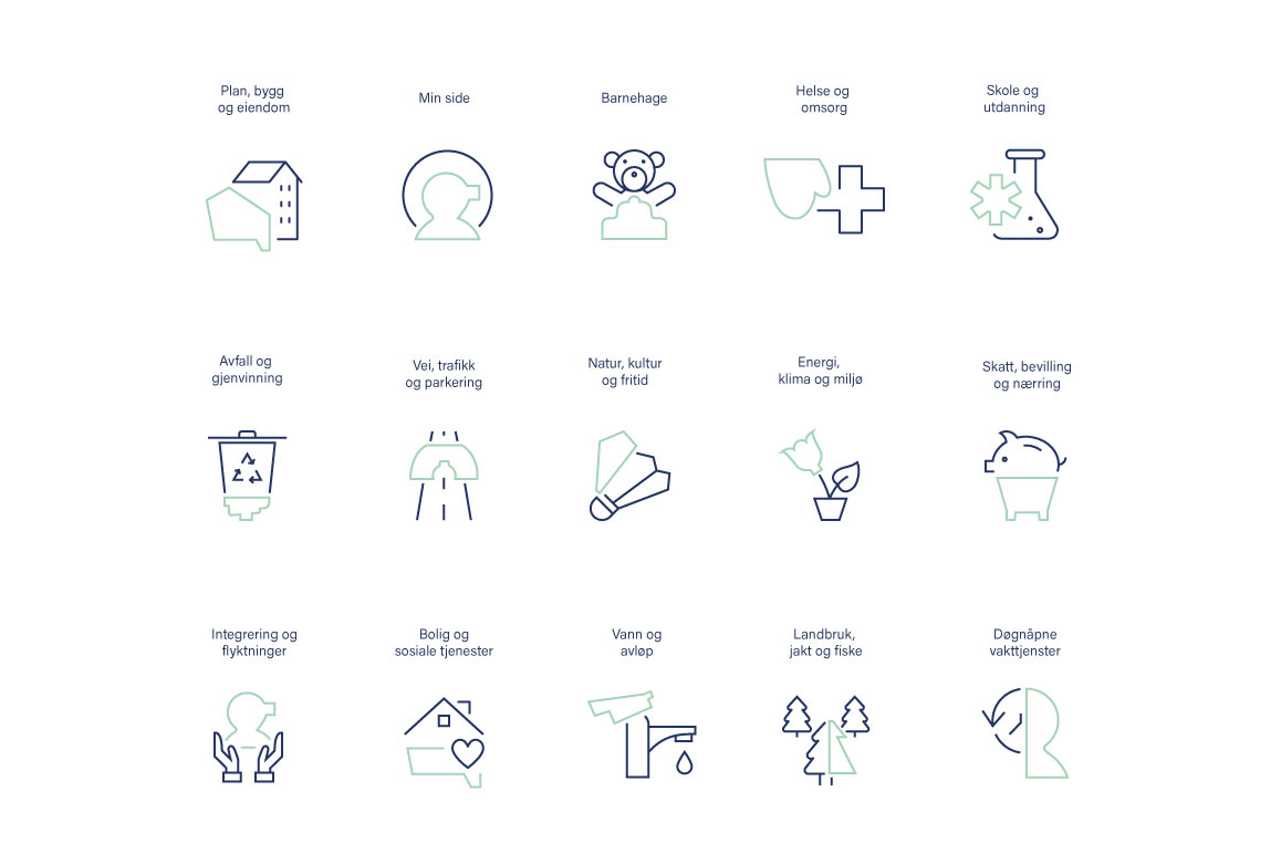
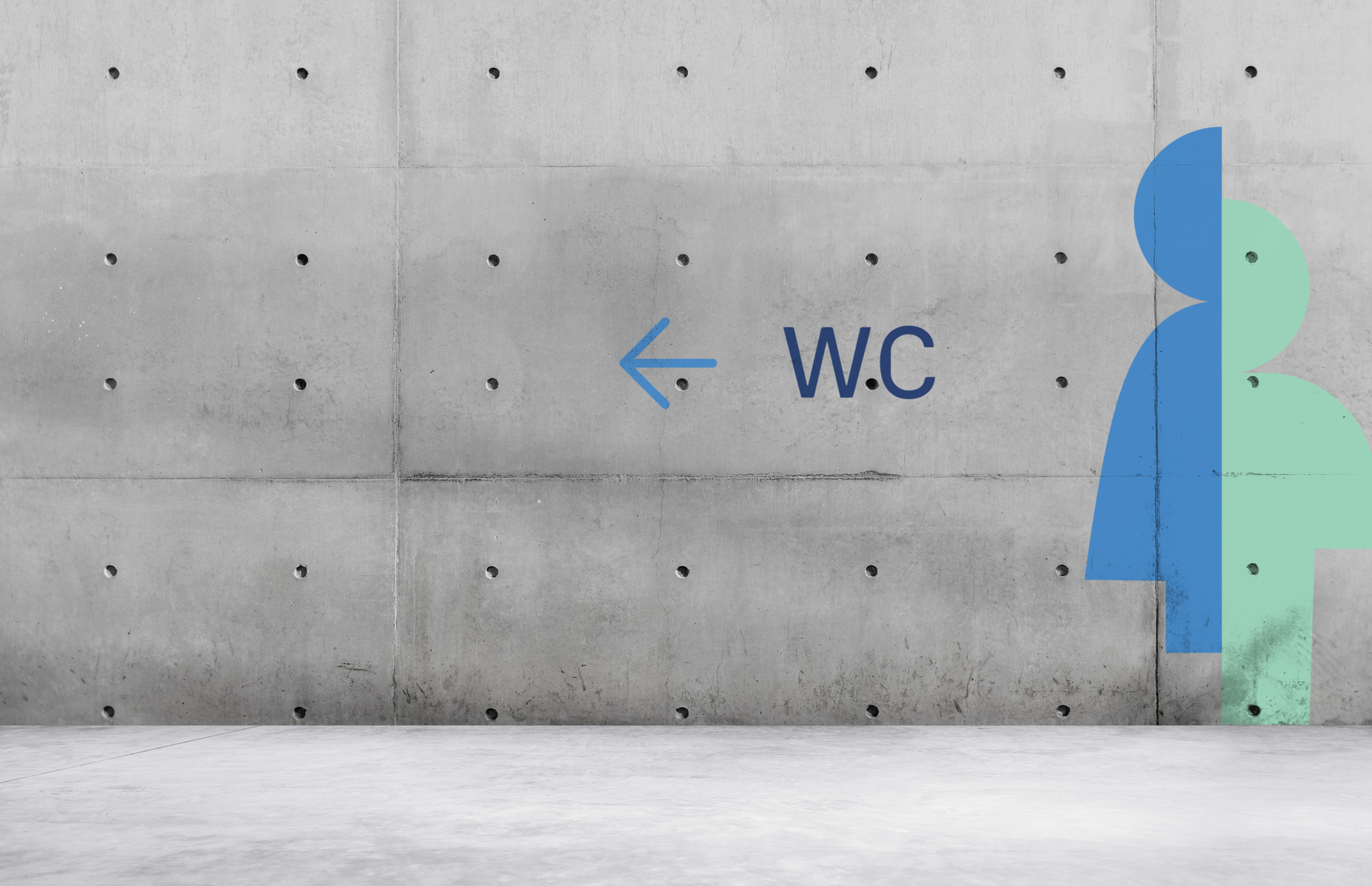
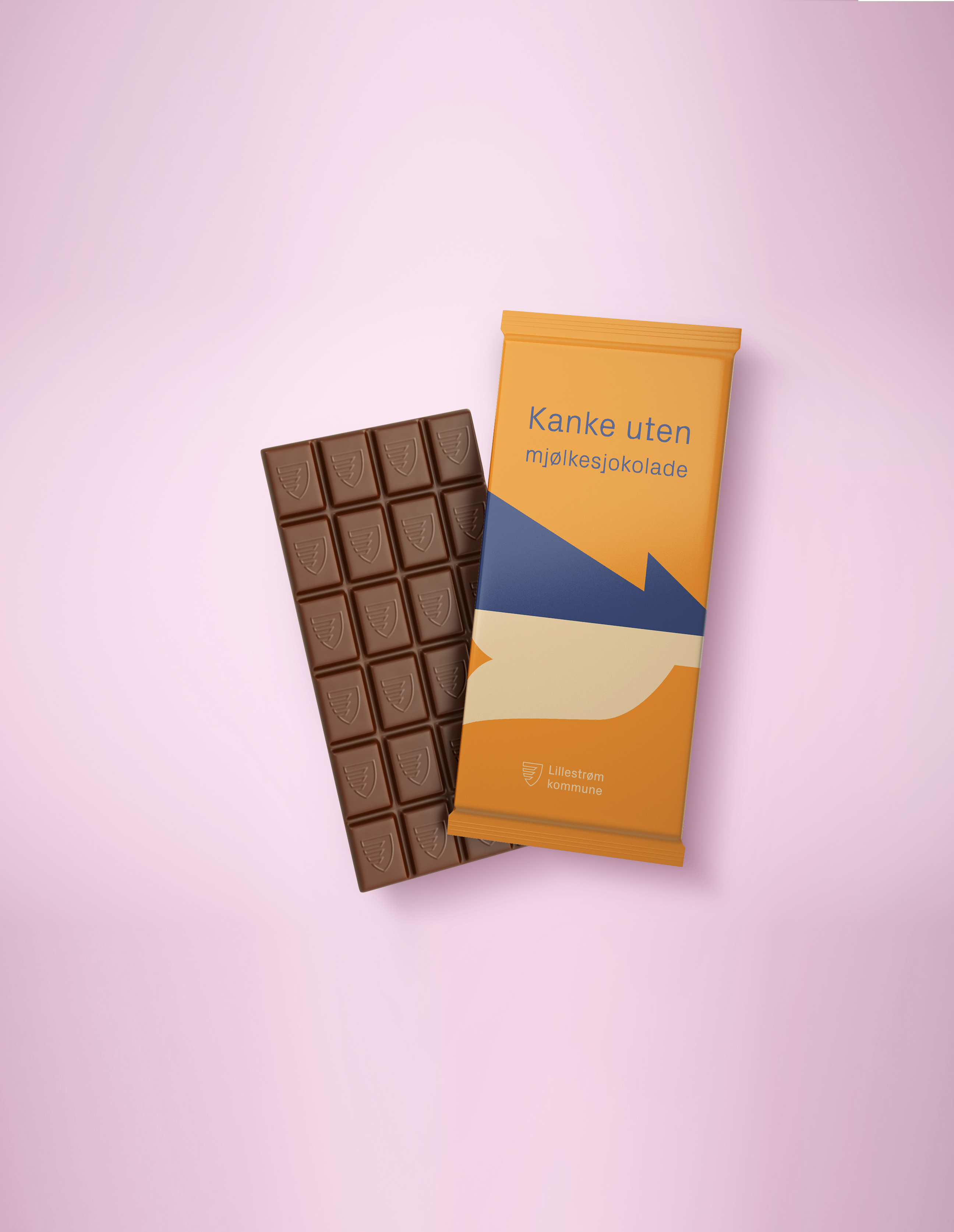
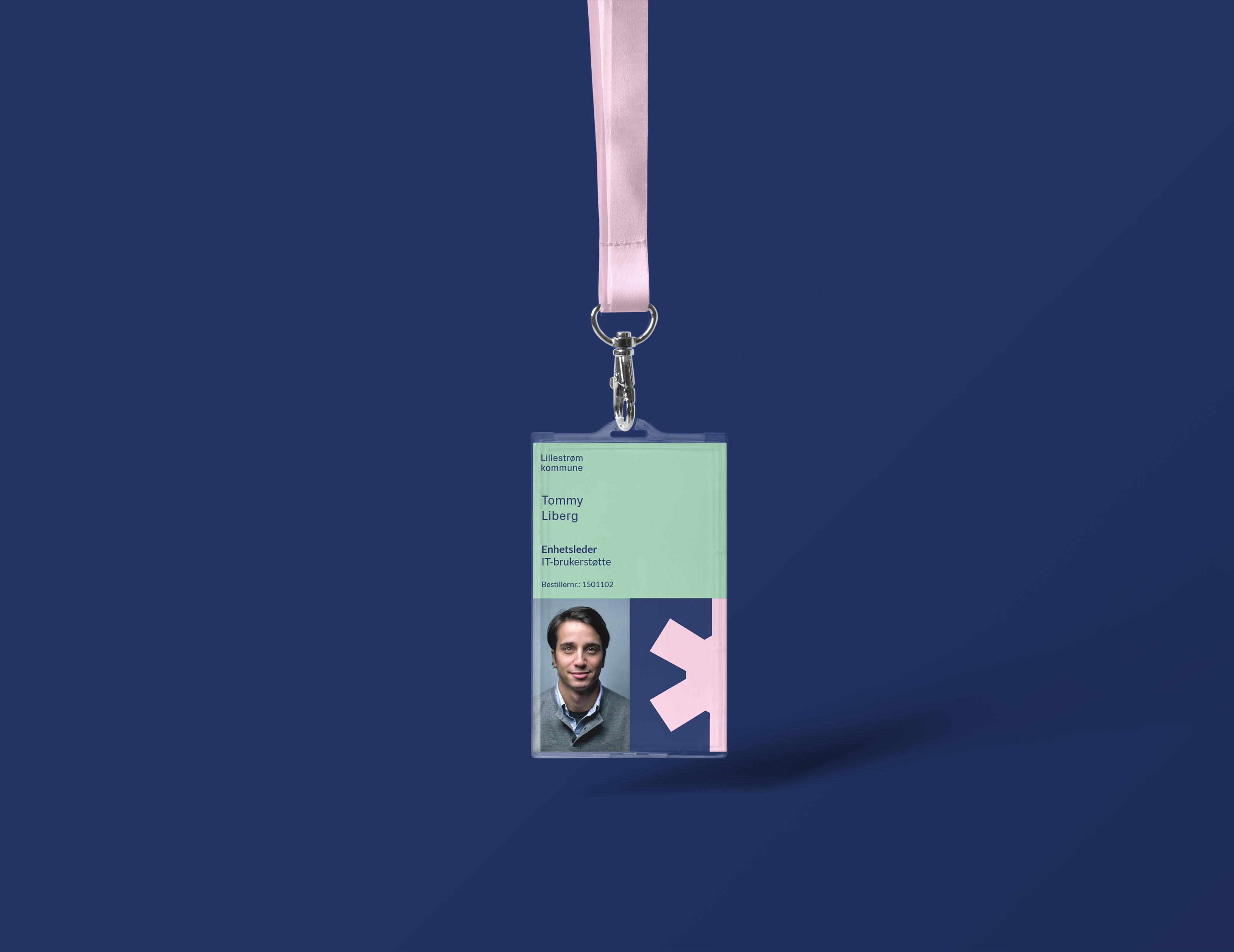
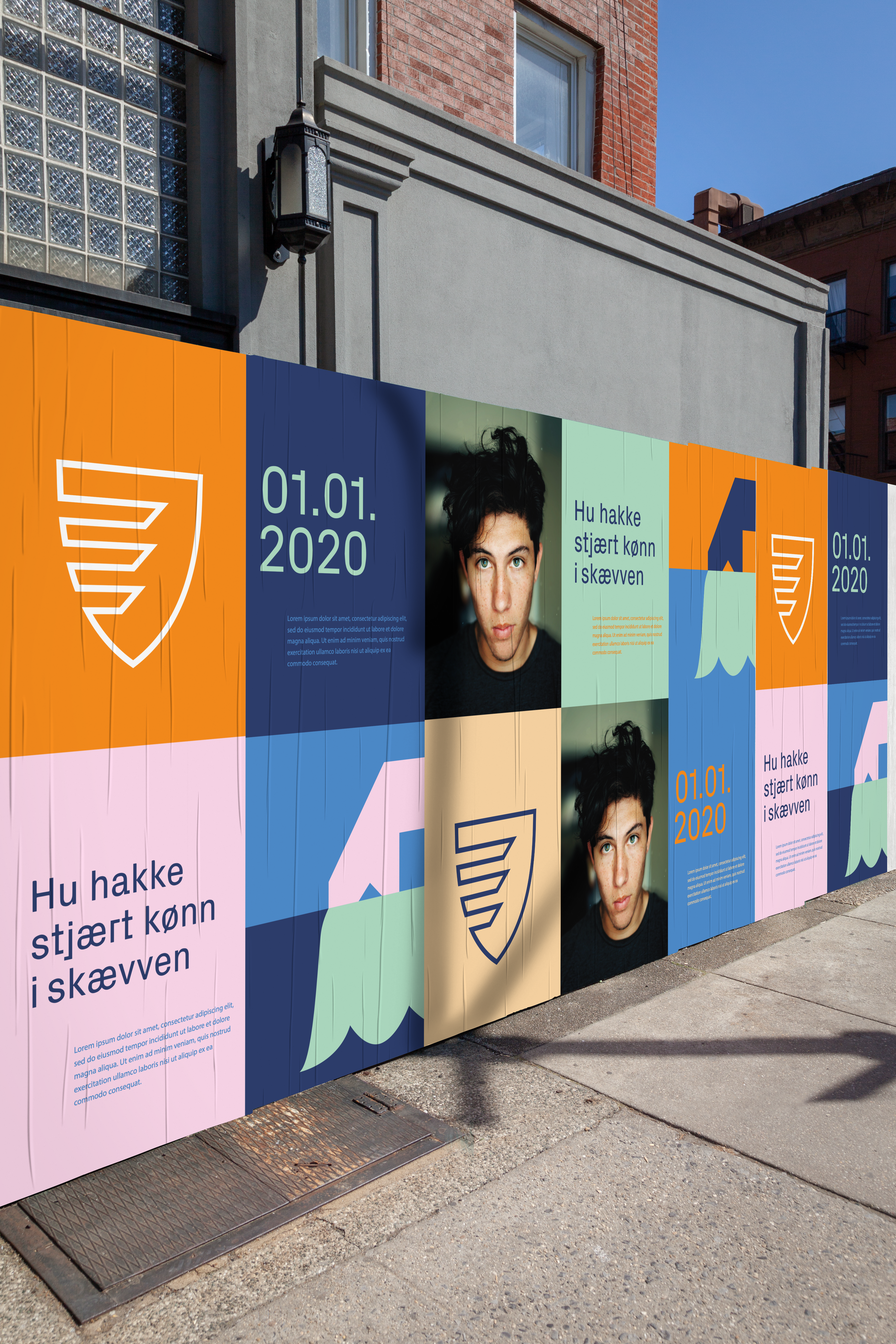
When former three municipalities became Lillestrøm
kommune Making Waves was asked to develop a uniting
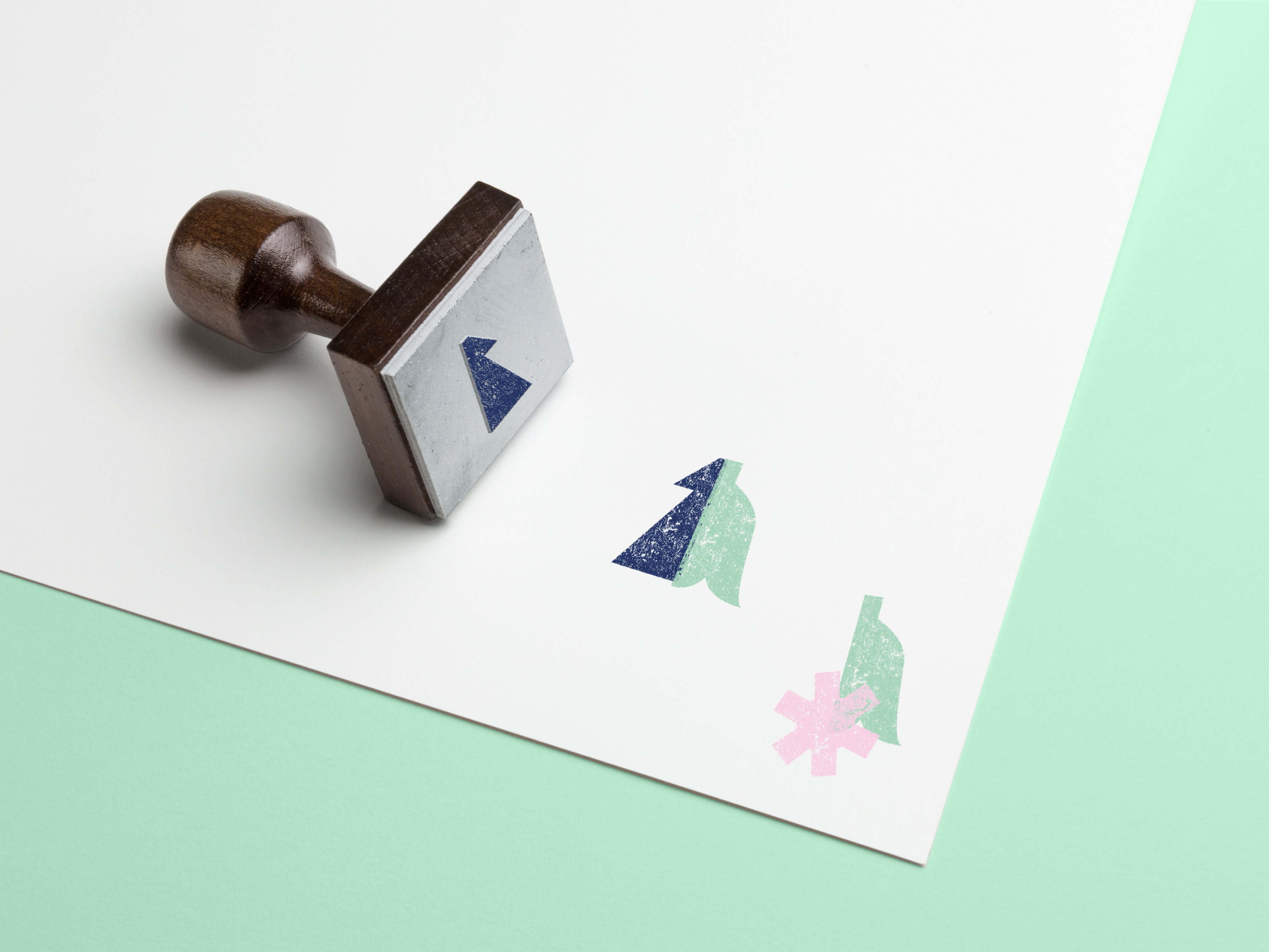
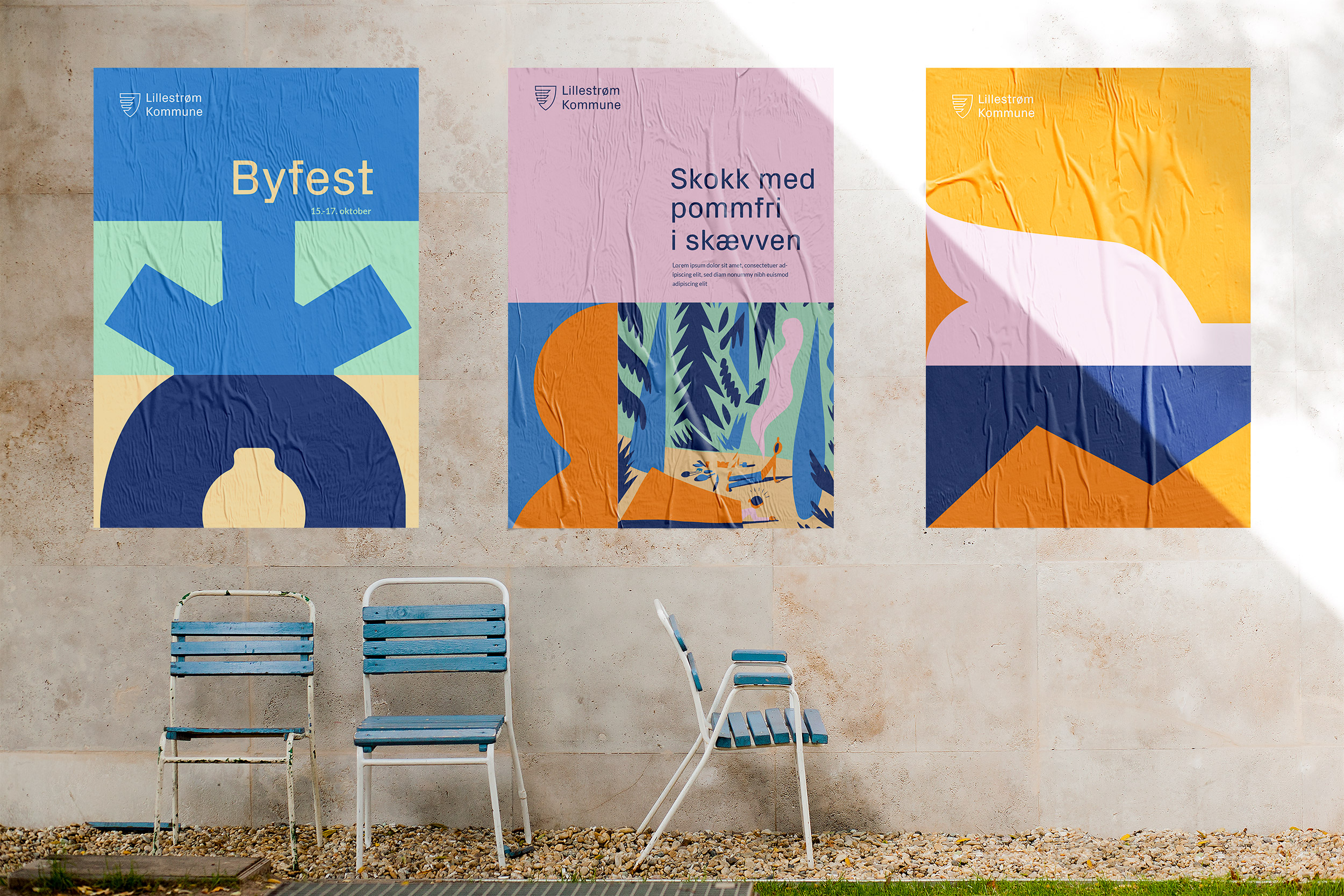
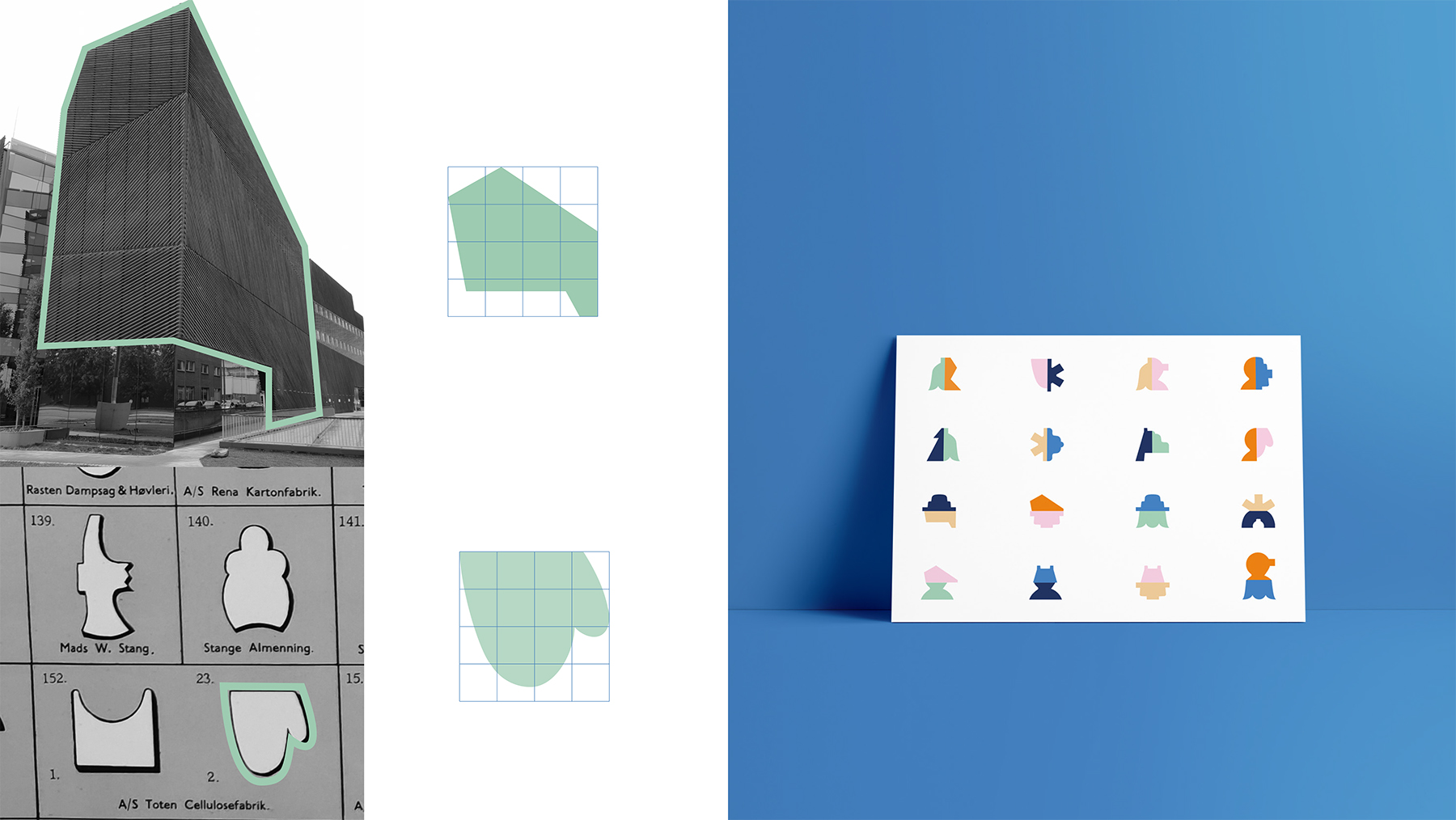
identity. Lillestrøms differences and contrasts became our
visual drivers, we divided and recombined stylised
versions of local characteristics (architecture, log floating
symbols, …). Contrasts were also determinative for the
choice of colours, typography, tone of voice, layouts etc.
What I learned: going through a complete branding
process over several months, developing and executing a
concept based on insights, Norwegian politics around
municipalities.
Design Manual
Some "skryt" from local media

Copyright: 2020 Julia Kuhley. Impressum